When we think of the color spectrum red and blue stand out as two of the most striking and impactful hues. They not only captivate our visual senses but also play a significant role in various fields, from art and design to science and psychology. One particularly intriguing phenomenon involving these colors is chromo stereopsis, which can make red and blue lines appear to shift in depth, creating a compelling visual effect. Let’s delve into the captivating world of red and blue, explore the science behind chromo stereopsis, and uncover why these colors are so powerful in our visual experiences.
What Makes Red and Blue So Unique?
The Power of Color Perception
Colors influence our perception in profound ways. Red and blue, being primary colors, have unique wavelengths that affect how we see and interpret them. Here’s a closer look:
- Red: With a wavelength of about 620 to 750 nanometers, red is often associated with energy, passion, and warmth. Its intensity can grab attention and evoke strong emotional responses.
- Blue: Ranging from 450 to 495 nanometers, blue is typically linked to calmness, stability, and serenity. It has a soothing effect and is often used to create a sense of tranquility.
The Science of Color Vision
Our eyes perceive color through a complex process involving photoreceptors in the retina, known as cones. Different cones are sensitive to different wavelengths, allowing us to distinguish a wide range of colors. Red and blue cones process these specific wavelengths, contributing to the vibrant and sometimes contrasting effects we experience.
The Phenomenon of Chromostereopsis
What Is Chromo stereopsis?
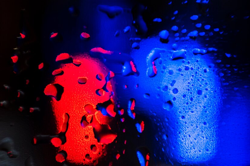
Chromo stereopsis is an optical illusion where colors seem to have different depths when viewed together. This effect is most pronounced with red and blue but can also occur with other color combinations. The illusion creates a sense that one color is “jumping out” or receding compared to another, leading to a three-dimensional appearance on a two-dimensional surface.
How Chromo stereopsis Works
The phenomenon occurs because of the way our eyes and brain process color and depth. Here’s a simplified explanation:
- Color Separation: Our eyes have different sensitivities to red and blue wavelengths. When these colors are placed close together, the brain may interpret them as being at different depths due to the variations in how each color is processed.
- Depth Perception: Chromo stereopsis relies on the brain’s ability to perceive depth based on visual cues. When red and blue are used in specific patterns, the brain may perceive one color as being in front of the other, creating an illusion of depth.
Applications and Examples of Chromostereopsis
Art and Design
Chromo stereopsis has fascinated artists and designers for decades. By strategically using red and blue, creators can add depth and dynamic effects to their work. Some notable applications include:
- 3D Art: Artists use red and blue to create artwork that appears three-dimensional when viewed with the naked eye, enhancing the visual impact of their creations.
- Graphic Design: Designers incorporate chromo stereopsis in logos, advertisements, and digital media to capture attention and create visual interest.
Science and Technology
In the realm of science and technology, chromo stereopsis has practical implications:
- Visual Displays: Understanding how colors interact in different contexts helps in designing displays and screens that minimize visual distortion and enhance user experience.
- Psychological Studies: Researchers study chromo stereopsis to understand how color and depth perception affect visual processing and cognitive responses.
Challenges and Considerations
Color Sensitivity and Variations
Not everyone experiences chromo stereopsis in the same way. Individual differences in color sensitivity and depth perception can influence how one perceives the effect. Factors such as:
- Color Blindness: People with color blindness may not experience chromo stereopsis as vividly or may perceive colors differently.
- Lighting Conditions: The effect can vary depending on the lighting conditions and the medium in which colors are presented.
Designing with Chromo stereopsis in Mind
When incorporating chromo stereopsis into design or art, it’s important to consider:
- Color Contrast: High contrast between red and blue can enhance the depth effect but may also cause visual discomfort if not balanced properly.
- Viewer Experience: Designers should account for the viewer’s perspective and ensure that the depth effect is visually engaging without causing strain or confusion.
Exploring Creative Uses of Red and Blue
Fashion and Interior Design
Red and blue are often used together in fashion and interior design to create bold and striking looks. Here’s how they’re used:
- Fashion Trends: Combining red and blue in clothing and accessories can make a fashion statement and create eye-catching ensembles.
- Interior Decor: These colors can be used in home decor to create vibrant and energetic spaces or to achieve a classic and timeless aesthetic.
Marketing and Branding
In marketing and branding, red and blue are used strategically to evoke specific emotions and messages:
- Brand Identity: Many brands use red and blue to convey trust, reliability, and excitement. The color combination can make logos and packaging stand out.
- Advertising: Advertisements often use red and blue to grab attention and create memorable visual experiences.
The Cultural Significance of Red and Blue
Symbolism and Meaning
Red and blue carry significant symbolism in various cultures:
- Red: Often represents passion, danger, or celebration. In many cultures, red is a color of importance and power.
- Blue: Symbolizes tranquility, loyalty, and wisdom. It is commonly associated with calmness and reliability.
Historical Context
Throughout history, red and blue have been used in significant ways:
- Art History: From ancient cave paintings to modern masterpieces, red and blue have played a central role in artistic expression.
- National Flags: Many national flags feature red and blue, symbolizing various aspects of national identity and heritage.
Conclusion
Red and blu’e are more than just colors; they are powerful tools that influence how we perceive the world around us. The phenomenon of chromo stereopsis highlights the fascinating interplay between color and depth perception, demonstrating the profound impact colors can have on our visual experiences.
Whether in art, design, science, or everyday life, red and blu’e continue to captivate and inspire. By understanding the science behind these colors and their effects, we can appreciate their role in shaping our visual and emotional experiences. So, the next time you see red and blu’e in action, remember the intriguing ways these colors can transform your perception and bring depth to the world around you.