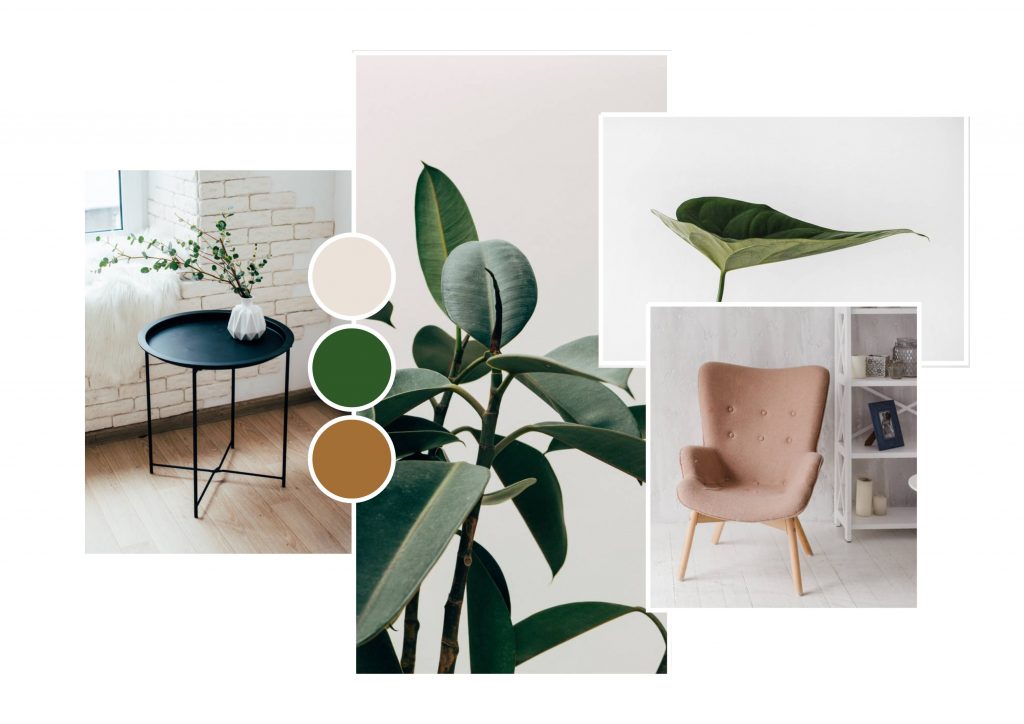
In the dynamic world of web and graphic design, trends shape the visual landscape and help creators connect with their audience in impactful ways. As we step into 2024, Colorful Minimalism in 2024 Web and Graphic Design has emerged as a leading trend, blending simplicity with vibrant color schemes. This fusion creates designs that are clean, modern and full of life, offering a fresh approach to traditional minimalism that feels both inviting and engaging.
Gone are the days when minimalism was strictly associated with muted tones, monochromatic palettes, and stark compositions. Colorful minimalism retains the principles of simplicity—open space, clear typography, and essential design elements—but adds bold and playful colors to create an engaging visual experience. This trend is rapidly gaining popularity, not only because of its aesthetic appeal but also due to its versatility and relevance across various industries, from tech to fashion and beyond.
The Evolution of Minimalism in Design
Minimalism has been a central theme in design for decades, celebrated for its focus on function, clarity, and elegance. The classic minimalistic design often relied on monochrome color schemes, clean lines, and a no-frills approach that emphasized space and form over decorative details. However, as the design world has evolved, so has minimalism, paving the way for more experimentation with colors, textures, and playful elements.
Colorful minimalism represents the next chapter in this evolution. Rather than stripping away all visual embellishments, designers are now embracing the use of bright, vibrant colors to enhance minimalist layouts without overwhelming them. This approach maintains the ethos of minimalism—clarity, functionality, and focus—while injecting energy and dynamism into designs.
As consumers become more visually literate and the demand for unique yet user-friendly designs grows, colorful minimalism offers a perfect balance of simplicity and creativity, making it a top trend for 2024.
Why Colorful Minimalism?
Several factors contribute to the rise of colorful minimalism in web and graphic design.
Visual Appeal and Accessibility
One of the primary reasons for colorful minimalism’s popularity is its ability to capture attention while maintaining a sense of balance and order. Bright, bold colors naturally attract the eye, while the minimalist structure ensures that designs remain uncluttered and easy to navigate. This makes colorful minimalism ideal for websites, apps, and marketing materials, where both visual impact and functionality are crucial.
Moreover, the use of vibrant colors enhances accessibility in design. Bold contrasts between colors improve readability and make interfaces more user-friendly, particularly for users with visual impairments. In 2024, accessibility remains a key concern for designers, and colorful minimalism is a trend that addresses this need while remaining visually engaging.
Emotional Resonance
Colors have a powerful impact on human emotions, and colorful minimalism allows designers to use color psychology to their advantage. While traditional minimalism often conveyed calmness and sophistication, colorful minimalism can evoke a wider range of emotions, from joy and excitement to creativity and curiosity.
By thoughtfully integrating color into minimalist designs, brands can create deeper emotional connections with their audience. For example, a tech company might use bright blues and greens to convey innovation and trust, while a fashion brand might opt for playful pinks and purples to inspire creativity and individuality. The versatility of colorful minimalism allows for designs that are not only functional but also emotionally resonant.
Adaptability Across Industries
Colorful minimalism is not confined to any specific industry or type of content. Its versatility makes it applicable to a wide range of fields, from tech startups to lifestyle brands, educational platforms, and e-commerce. For instance, a tech company might use vibrant yet minimalistic designs to emphasize sleek functionality, while a wellness brand might adopt a more soothing, pastel-hued palette to convey tranquility and balance.
This trend’s adaptability is one of its strongest features, as it can be tailored to suit the unique needs and identities of different businesses while maintaining a modern, professional look.
Key Elements of Colorful Minimalism
Colorful minimalism hinges on a few key design elements that ensure balance between simplicity and vibrancy. Understanding and applying these elements effectively will allow designers to harness the power of this trend.
Bold, Vibrant Colors
The most defining feature of colorful minimalism is, of course, the use of bold, saturated colors. Designers can experiment with a variety of hues, from neon and electric tones to softer pastels, depending on the intended mood and audience. These colors are typically applied sparingly, often as accent elements that stand out against a more neutral or subdued backdrop.
This strategic use of color draws attention to specific parts of the design—whether it’s a call-to-action button on a website or a key piece of information in a graphic—without overwhelming the viewer. The result is a design that feels dynamic and energetic, yet controlled and purposeful.
Clean Typography
Typography plays a critical role in any minimalist design, and colorful minimalism is no exception. The fonts chosen for these designs are typically clean, modern, and easy to read. Sans-serif fonts, known for their clarity and simplicity, are often the go-to choice, although serif fonts can also be used to add a touch of sophistication.
Pairing bold typography with vibrant colors can create a strong visual hierarchy, guiding the viewer’s eye through the design in a way that feels intuitive and engaging. The key is to ensure that typography complements the color scheme without competing with it—clean, legible text enhances the overall design without detracting from its minimalistic essence.
Strategic Use of White Space
White space, or negative space, is a foundational aspect of minimalism, and it remains just as important in colorful minimalism. White space ensures that the design feels open and uncluttered, allowing the vibrant colors to stand out without overwhelming the viewer.
In 2024, designers are experimenting with more creative uses of white space, using it to enhance the flow of a design or to highlight specific elements. This careful balance of space and color creates designs that feel both dynamic and organized, offering a visually appealing experience that is also user-friendly.
Minimalistic Layouts
The layouts in colorful minimalism follow traditional minimalist principles—grid-based designs, symmetry, and clear structure. However, these layouts are enlivened by the use of color and creative typography. This approach results in designs that feel polished and professional while still having a playful edge.
Whether applied to a website, app interface, or marketing material, these minimalistic layouts ensure that the design remains functional and easy to navigate, even as it incorporates more vibrant elements.
How to Implement Colorful Minimalism in Your Designs
For designers looking to adopt colorful minimalism in their 2024 projects, there are several strategies to keep in mind.
Choose Your Color Palette Wisely
The success of colorful minimalism hinges on the careful selection of colors. Start by identifying the emotions or message you want to convey with your design. From there, choose a limited color palette that aligns with this vision. It’s important not to go overboard—too many colors can quickly turn a minimalist design into something chaotic.
A good rule of thumb is to select one or two vibrant colors as the focal points of the design, paired with more neutral tones like white, gray, or black. This approach allows the bold colors to pop without overwhelming the design’s structure.
Focus on Simplicity and Functionality
Even though colorful minimalism allows for more creative freedom with color, it’s essential to maintain the core principles of minimalism: simplicity and functionality. Every element of the design should have a clear purpose, and nothing should feel extraneous or decorative for the sake of decoration.
When designing a website, for example, ensure that navigation is intuitive, the content is easy to read, and the design elements guide the user toward their goal without distractions.
Embrace White Space
White space is your friend in colorful minimalism. It prevents the design from feeling too busy and allows the bold colors to make a statement. Use white space strategically to highlight key elements, such as calls to action, important information, or central imagery.
Stay Current with Design Tools and Trends
Colorful Minimalism in 2024 Web and Graphic Design the rapid pace of technological advancement means that designers have more tools at their disposal than ever before. Leveraging design software, no-code platforms, and AI-driven tools can help you experiment with different layouts, color schemes, and interactive elements more efficiently. Staying current with these tools allows designers to push the boundaries of colorful minimalism while maintaining relevance in a tech-driven world.
The Future of Colorful Minimalism
As we look toward the future, it’s clear that Colorful Minimalism in 2024 Web and Graphic Design is more than just a passing trend. Its ability to balance simplicity with vibrant expression makes it a versatile and enduring design philosophy. In a world where attention spans are shrinking and digital clutter is increasing, colorful minimalism offers a way to stand out while keeping things streamlined and accessible.
Brands and designers that embrace this trend in 2024 and beyond will find themselves at the forefront of a design movement that prioritizes both aesthetics and user experience. By adopting colorful minimalism, you can create designs that are not only visually captivating but also effective in communicating your message clearly and powerfully.
Conclusion
Colorful Minimalism in 2024 Web and Graphic Design is shaping up to be one of the most influential design trends in 2024. Its marriage of bold colors with minimalist principles offers a fresh, modern aesthetic that appeals to both businesses and consumers alike. Whether you’re a seasoned designer or just starting out, incorporating colorful minimalism into your projects can help you create designs that are both beautiful and functional, standing out in a crowded digital landscape.


